
How to Select Uniform Colors for Your Brand
August 15, 2026
How to Select Uniform Colors for Your Brand
Choose a primary color tied to your brand personality, support it with neutrals, and reserve one accent color strictly for badges, CTAs, and role markers. That single decision framework prevents the most expensive mistake in uniform programs: ordering thousands of pieces before confirming the colors actually work on fabric.
Three things to do right now:
- Pick your primary HEX code from your existing logo or brand guidelines, not from memory.
- Choose one neutral (white, charcoal, or navy) that works as the garment body base.
- Select one accent color and run a contrast check against both the neutral and the primary before you commit.
Key Takeaways
Selecting uniform colors for your brand requires a documented palette with exact color codes, a physical proof on production fabric, and a pilot test before full production runs.
| Point | Details |
|---|---|
| Start with exact codes | Record HEX, PMS, CMYK, and RGB values before contacting any vendor. |
| Apply the 60-30-10 rule | Use your primary for 60% of garment surface, supporting for 30%, accent for 10%. |
| Test on actual fabric | Approve only after a physical proof survives three launder cycles. |
| Check contrast on badges | Use WCAG’s 4.5:1 contrast ratio as your minimum for name tags and text. |
| Jam4apparel for production | Jam4apparel provides in-house proofs, embroidery thread matching, and screen-print separations from your specs. |
Table of Contents
- Why uniform color choices shape brand perception more than most teams realize
- How to select uniform colors for your brand: start with your identity audit
- How industry norms and work environments constrain your color choices
- How to build a practical uniform color palette
- What production specs you must provide before ordering
- How to test colors and plan a phased rollout
- Are your uniform colors accessible and legible for everyone?
- Common mistakes that lead to reorders and how to avoid them
- What does a uniform program actually cost?
- An editorial perspective on what most brands get wrong
- Jam4apparel makes color selection and production straightforward
- Sources
Why uniform color choices shape brand perception more than most teams realize
Color is doing more work on a uniform than on any other brand surface. A website visitor can scroll past a color they dislike. A customer standing in front of your employee cannot. The uniform is the brand, in person, for as long as that interaction lasts.
Matching shirts signal cohesion and professionalism in ways that customers register before a single word is spoken. Blue reads as trustworthy and calm, which is why it dominates healthcare, finance, and corporate environments. Green signals wellness and sustainability. Navy and charcoal project authority without the aggression of black. Red and orange create urgency and energy, useful in fast-casual food service or fitness. Warm neutrals like tan and cream feel approachable and premium simultaneously.

Employees respond to color too. Uniforms in colors that feel professional and intentional tend to get worn correctly and consistently, which matters for brand consistency across a large team. A color that feels cheap or arbitrary often gets “personalized” in ways that undermine the whole program.
How to select uniform colors for your brand: start with your identity audit
Before you open a color picker or browse fabric swatches, document what your brand actually is. Pull your logo files, your website stylesheet, and any existing brand guidelines. Write down three adjectives that describe your brand personality — “approachable, energetic, trustworthy” or “premium, minimal, precise.” Those adjectives are your filter for every color decision that follows.
Then list every color code you already own:
- HEX codes from your digital assets (website, app, social templates)
- PMS (Pantone Matching System) codes from any existing print work
- CMYK values from printed collateral
- RGB values as a digital fallback
Design systems specify HEX, RGB, CMYK, and Pantone equivalents for cross-media accuracy, and uniforms are no exception. A color named “our blue” without a code is not a specification. It is a guess that will cost you a reorder.
Note where the uniforms will actually appear: a brightly lit retail floor, an outdoor construction site, a dim restaurant back-of-house, or a client-facing office. Lighting changes how colors read, and that context shapes which shades work.
Pro Tip: Create a one-page color reference sheet listing each color’s HEX, RGB, PMS, and CMYK values, plus a note on acceptable saturation ranges. Include a “do not use” column with shades that are close but wrong — the muddy version of your teal, the washed-out version of your navy. Send this sheet to every vendor before any conversation about samples.
How industry norms and work environments constrain your color choices
Your brand goals and your industry’s expectations do not always point in the same direction. Knowing where they conflict saves you from a uniform that looks great in a brand deck and fails on the floor.
Common industry patterns worth knowing before you finalize a palette:
- Healthcare: Calming blues and greens dominate because they signal cleanliness and reduce patient anxiety. Bright or saturated colors can feel clinical in the wrong way.
- Hospitality and food service: Warm, inviting tones work well front-of-house. Dark colors (navy, black, deep burgundy) are practical back-of-house because they hide stains through a full shift. Restaurant uniform color choices often balance brand warmth with stain-management reality.
- Retail: Brand colors can be more expressive here, but high-contrast combinations help customers identify staff quickly in a busy store.
- Logistics and construction: High-visibility yellow, orange, and lime green are often legally required for safety. ANSI/ISEA 107 sets the standard for high-visibility apparel in the US, and brand color preferences are secondary to those requirements.
Outdoor environments bleach colors faster than indoor ones. Fabric type matters too: a polyester blend holds color differently than a cotton twill, and a color that looks rich on a cotton sample can look washed out on a performance poly after six months of sun exposure. Factor in your team’s actual working conditions before locking in a palette.
How to build a practical uniform color palette
Build around one primary, one or two supporting colors, a neutral system, and one reserved accent. Adobe Express recommends starting with a neutral base, adding two “pop” colors, and choosing a single CTA color reserved for interactive elements or badges so it retains meaning — the same logic applies directly to uniforms.
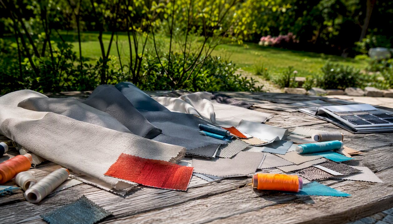
The 60-30-10 rule gives you the proportions: roughly 60% of visible uniform surface in your primary or neutral base, 30% in a supporting color (panels, trim, collar), and 10% in your accent (badge, embroidered logo, pocket detail).
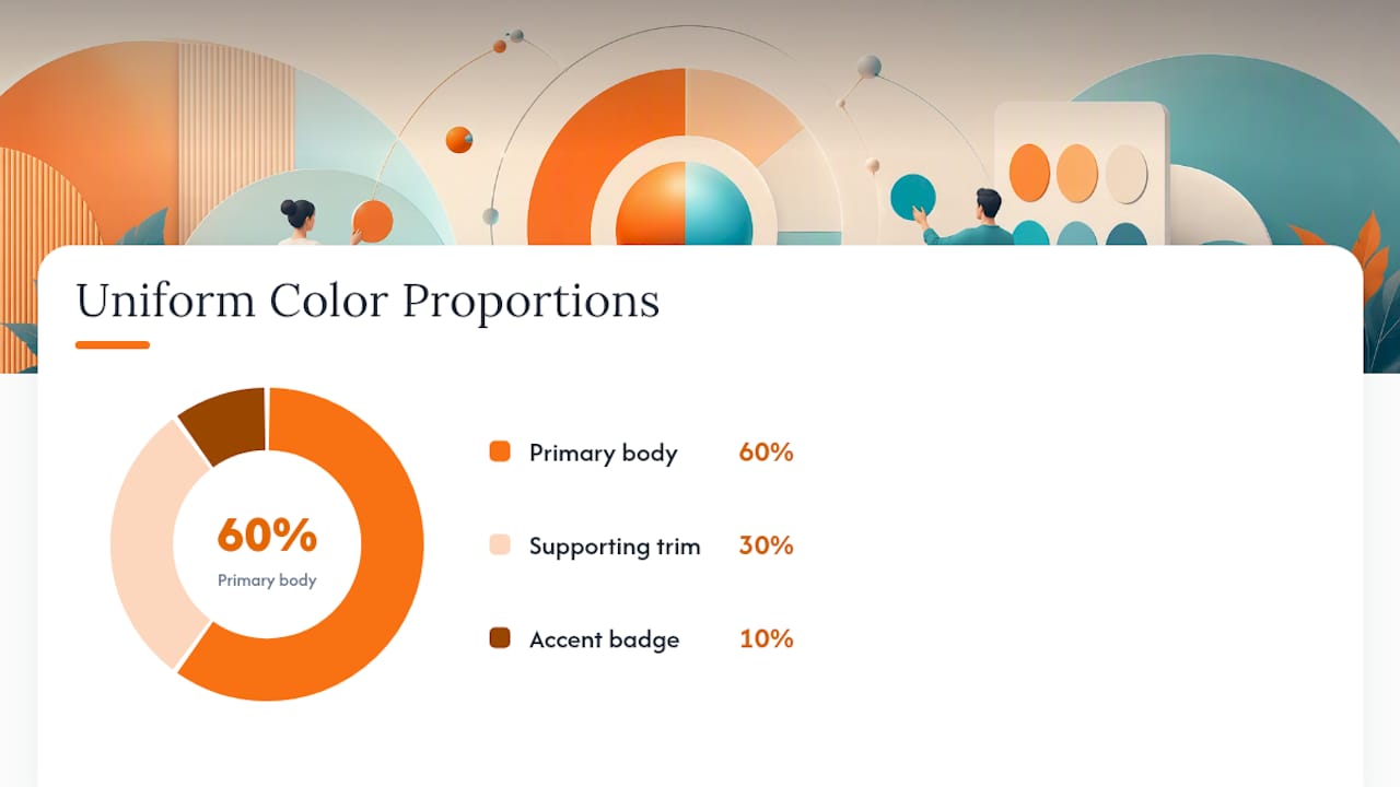
A practical working palette runs 4–6 colors total, with distinct roles for each. Here is how those roles map to uniform pieces:
| Palette Role | Color Example | Uniform Application |
|---|---|---|
| Primary | Navy blue | Garment body, main fabric |
| Supporting | Cool gray | Collar, sleeve panels, trim |
| Neutral | Off-white | Name tag background, apron base |
| Accent | Bright coral | Embroidered logo, badge, pocket detail |
Three palette examples that work in practice:
- Trust-focused: Navy primary + cool gray supporting + bright coral accent. Reads as professional with one warm pop.
- Wellness-focused: Sage green primary + warm tan neutrals + deep navy accent. Calm, approachable, and grounded.
- Premium: Charcoal primary + cream neutrals + metallic gold accent. Minimal and authoritative.
Testing saturation at 100%, 80%, and 60% before finalizing helps you find the shade that still reads as your brand when it fades slightly after laundering. A color that only works at full saturation is fragile.
Pro Tip: Your accent color needs to stay visible as an embroidered badge on the actual fabric, not just on a screen. Embroidery thread has a sheen that shifts color perception. Always evaluate the accent on a stitched sample, not a digital mockup.
What production specs you must provide before ordering
Specify HEX, RGB, PMS, and CMYK values plus a fabric swatch and your intended decoration method before any order goes into production. Ambiguous specs are the single biggest driver of reorders.
Your vendor-ready spec sheet should include:
- HEX code for digital proofs and mockups
- PMS (Pantone) code for spot-color screen printing and embroidery thread matching
- CMYK values for any printed elements (labels, patches, heat transfers)
- RGB values as a digital fallback for proof review
- Fabric type and weight (100% cotton, poly-cotton blend, performance poly)
- Decoration method (screen print, embroidery, DTF transfer, custom patch)
- Embroidery thread brand and color code (Madeira, Isacord, or equivalent)
- Wash cycle expectations (commercial laundry vs. home wash)
Production limits to know before you finalize:
- Standard screen printing typically handles 1–6 spot colors per design; each additional color adds cost and registration complexity.
- Dark fabrics require an underbase layer for light colors, which affects color accuracy and adds a print pass.
- Embroidery thread reads differently than ink. A PMS color matched to thread will look slightly different than the same PMS on a screen-printed patch. Request both side by side.
- Color shifts by fabric: polyester blends can cause dye migration with heat-applied transfers, pushing colors warmer.
Pro Tip: Request a physical proof on the exact fabric going into production, then run it through three wash cycles before approving. A color that survives laundering on the proof will survive it on the full order.
How to test colors and plan a phased rollout
Validate on-fabric proofs, run wear-and-launder tests, and pilot with a representative staff group before full production. Skipping any of those three steps is where reorder costs accumulate.
A practical timeline for a mid-size uniform program:
- Weeks 1–2: Finalize palette document, gather HEX/PMS specs, select garment styles.
- Weeks 3–4: Order fabric swatches and digital mockups from your vendor.
- Weeks 5–6: Receive physical proofs; run launder and stain tests.
- Weeks 7–8: Pilot with 5–10 employees across relevant roles and environments.
- Weeks 9–10: Collect feedback, make final adjustments, approve for full production.
- Weeks 11–14: Full production run and phased distribution.
Pilot checklist:
- Test visibility in the actual work environment (store floor, outdoor site, dim kitchen).
- Run three launder cycles and check for color shift, fading, or bleed.
- Check stain resistance on the most common stains for that role.
- Confirm size range covers your full team without fit compromises.
- Gather written feedback from pilot employees on comfort and appearance.
- Get sign-off from management before releasing the full order.
Sample costs are real money, but they are a fraction of a reorder on 500 units. A $200 proof process that catches a color problem saves a $4,000 reorder.
Are your uniform colors accessible and legible for everyone?
Sufficient contrast on name tags, badges, and any text or iconography is not optional. The W3C’s WCAG guidelines set a minimum contrast ratio of 4.5:1 for normal text and 3:1 for large text. While WCAG was written for digital interfaces, the contrast logic applies directly to printed badges, embroidered name tags, and safety labels on uniforms.
Key accessibility points for uniform programs:
- Never rely on hue alone to differentiate roles. A red badge vs. a green badge looks identical to someone with red-green color blindness, which affects roughly 8% of men. Add a shape, label, or pattern difference.
- Test badge text on both your light and dark fabric options. A white name on navy reads clearly; the same white name on a pale gray may not.
- Safety labels must meet ANSI contrast standards, not just brand preferences.
Pro Tip: Run your badge and name tag designs through a free color-blindness simulator like Coblis or Color Oracle before finalizing. Test text on both light and dark backgrounds in the same session.
Common mistakes that lead to reorders and how to avoid them
Most reorders trace back to one of three failures: no physical proof, ambiguous color specs, or skipping the pilot. Testing colors in real contexts reduces the chance of costly rework, and that finding holds as true for fabric as it does for digital design.
Mistakes to cut from your process:
- Specifying colors by name only (“our blue,” “forest green”) with no HEX or PMS code.
- Choosing a trend color as your primary. Trend colors age quickly and are safer as swap-in seasonal accents.
- Ignoring how fabric type changes color appearance.
- Skipping a neutral set and using only brand colors, which creates visual noise at scale.
- Approving a digital mockup without a physical proof on the actual garment.
- Letting badge or name tag text fail contrast checks because “it looks fine on screen.”
Red flags that should delay approval:
- No physical proof on the production fabric
- No neutral color in the palette
- Badge or name tag text that fails a contrast check
- Color specified only by name, not by code
- No launder test completed
What does a uniform program actually cost?
Budget for four cost layers: design, production, sampling, and replacement. Skipping the sampling layer to save money upfront almost always increases the total cost.
Design costs include brand guideline development or updates, palette documentation, and mockup creation. If you are working with an in-house designer, this is time. If you are outsourcing, expect to pay for revisions.
Production costs vary by decoration method, garment quantity, and color count. Screen printing costs drop significantly at higher quantities; embroidery pricing is more stable but rises with stitch count. Custom uniforms over stock options give you color accuracy and brand consistency that generic stock cannot match, and the per-unit cost difference narrows quickly at volume.
Sampling costs cover physical proofs, launder tests, and pilot garments. Budget this as a fixed line item, not an afterthought.
Replacement costs are the most underestimated. A uniform program needs a documented reorder process with color codes on file. Without it, replacement pieces ordered 18 months later often do not match the originals. Documenting HEX, CMYK, and PMS codes before the first order is what makes reorders accurate and fast.
Premium employee uniforms from a quality supplier also reduce replacement frequency because the garments hold color and shape through repeated commercial laundering.
An editorial perspective on what most brands get wrong
Most brands treat uniform color selection as a design decision. It is actually a production decision that happens to involve design.
The teams that end up with reorders almost always made the same mistake: they approved a color on a screen and assumed the fabric would follow. It does not. Fabric dye, embroidery thread, and screen-print ink each interpret the same PMS code differently, and none of them look exactly like a backlit monitor. The gap between “approved in the mockup” and “received from production” is where most uniform programs lose money.
The other overlooked factor is neutrals. Brands obsess over their primary and accent colors and then pick a generic white or black as the garment base without specifying it. That “white” becomes three different whites across three reorders from two vendors. A near-white with a specific HEX code is a specification. “White” is not.
The brands that get this right treat their palette document the same way they treat a legal contract: every value is written down, every acceptable variation is defined, and every vendor receives the same document before any conversation about pricing. That discipline is what makes a uniform program scalable.
Jam4apparel makes color selection and production straightforward
Getting from a palette decision to production-ready uniforms is where most programs stall. Jam4apparel handles the steps between: in-house color proofing, embroidery thread matching, screen-print color separations, and pilot runs before full orders go into production.
The in-house production model at Jam4apparel means your proof and your final order come from the same equipment, so the color you approve on the sample is the color you receive at scale. That consistency is what separates a managed uniform program from a series of vendor guesses. Whether you need corporate apparel for a professional team or industry-specific uniforms across multiple roles, Jam4apparel works from your HEX and PMS specs to deliver accurate, durable results. Request a quote at Jam4apparel and bring your palette document — the faster you share your specs, the faster you get a proof in hand.
Sources
- How To Choose Brand Colors + Real-World Examples (2025)
- How To Build a Brand Color Palette (2026 Examples)
- How to Choose Brand Colors That Won’t Look Dated
Recommended
Ready to print your design?
Screen print, embroidery, and DTF — no minimums on many styles.