
The Shirt Logo Placement Guide for Sharp Branding
August 13, 2026
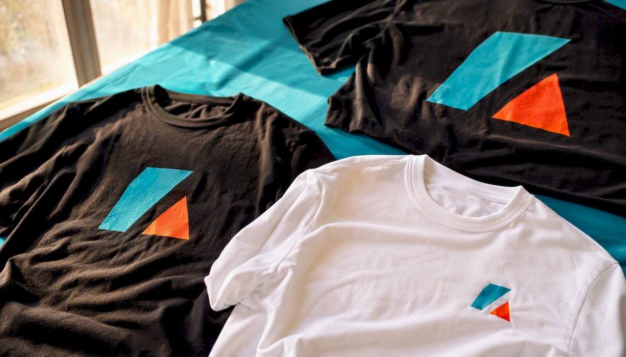
The Shirt Logo Placement Guide for Sharp Branding
For most business and uniform shirts, place a small logo on the left chest. For bold merch, event tees, or anything meant to turn heads, use center chest, full front, or full back. That one decision, made correctly, is the difference between a shirt that looks intentional and one that looks like an afterthought.
The rule of thumb that holds across almost every order: keep chest logos between 2.5 and 4 inches wide, and measure your anchor point down from the collar, not from the shoulder seam. That single habit makes placement repeatable across sizes.
Quick verdict by use-case:
- Left chest (2.5–4 in wide): Business apparel, uniforms, polos, corporate wear. Reads like a badge. Professional and understated.
- Center chest (3–6 in wide): Casual tees, school spirit wear, team shirts. Bolder than left chest, still clean.
- Full front (10–12 in wide): Merch drops, streetwear, event shirts. Maximum visual impact.
- Full back (10–13 in wide): Event shirts, sports teams, volunteer crews. Visible from a distance; pair with a small chest logo for front identification.
Key Takeaways
Correct logo placement on shirts comes down to three things: choosing the right zone for your brand tone, measuring from a fixed anchor point, and matching the placement to your decoration method.
| Point | Details |
|---|---|
| Left chest for business | Place logos 2.5–4 in wide, 3–4 in below the collar, for uniforms and corporate apparel. |
| Center or full front for merch | Use 3–6 in for casual tees and 10–12 in wide for bold merch or event shirts. |
| Measure from the collar | Anchor every placement in inches from the collar seam for repeatable results across sizes. |
| Match method to placement | Embroidery suits left chest; screen printing and DTF handle full-front and back prints best. |
| Jam4apparel | Provides free proofs with measurement callouts and in-house production for consistent placement across every size. |
Table of Contents
- How logo placement on shirts works: zones, anchor points, and common mistakes
- Exact measurements, anchor points, and sizing rules by garment
- How your decoration method changes placement, size, and durability
- What your artwork files need before you send them to production
- How brand tone should guide your placement choices
- Placement rules for polos, dress shirts, and uniforms
- The checklist to send your decorator so placement is executed correctly
- A practical perspective on what actually goes wrong with logo placement
- Jam4apparel makes placement straightforward from proof to production
- Sources
How logo placement on shirts works: zones, anchor points, and common mistakes
Every placement zone sends a signal before anyone reads the logo itself. Left chest is the standard for business apparel because it sits where a badge or pocket would go, which reads as authority and professionalism. Center chest is louder. Full front says retail. Full back says team.
A few terms worth knowing before you spec anything:
- Placement zone: The general region of the garment (left chest, upper back, sleeve, etc.).
- Anchor point: The specific spot on the garment from which you measure, usually the collar seam or shoulder seam.
- Visual center vs. file center: The visual center of a logo is where the eye lands. The file center is the geometric midpoint of the artwork canvas. These are often different, especially for logos with tall text or asymmetrical shapes.
Per-zone guidance:
- Left chest: 3–4 inches below the collar, 4 inches from the center of the shirt toward the left. Best for uniforms, corporate polos, hospitality staff, and any shirt where the logo should feel like a credential.
- Center chest: Starts roughly 3–5 inches below the collar. Works for casual tees, school apparel, and team shirts where the logo is the focal point.
- Full front: Centered on the chest, typically 3–4 inches below the collar at the top of the design. Merch, streetwear, and event shirts.
- Upper back / back collar: About 1 inch below the back collar seam. Used for secondary branding, a tagline, or a small sponsor mark. Keep it under 4 inches wide.
- Full back: Centered vertically and horizontally on the back panel. Sports teams, volunteer shirts, and event crews. Pair with a left-chest identifier on the front.
- Sleeves: 2–3 inches wide, placed 1–2 inches below the shoulder seam. Common for sponsor logos, secondary marks, and team numbers.
- Collar / back neck label area: Under 2 inches wide. Subtle branding or internal labeling.
Common mistakes by zone:
- Left chest placed too high (above the natural badge line) or too far toward the center looks off-balance.
- Full-front designs that cross the chest seam on a raglan or henley distort badly.
- Sleeve logos placed too close to the cuff lose readability when the sleeve is folded.
- Back logos centered on the file midpoint rather than the visual midpoint drift left or right on the finished shirt.
Pro Tip: Before sending your file to production, print the artwork at actual size and hold it against the shirt. You will catch size and position problems in 30 seconds that a digital mock-up misses entirely.
Exact measurements, anchor points, and sizing rules by garment
Getting placement right once is luck. Getting it right across a 200-piece order in five sizes is a system. The system starts with anchor-point measurements stated in inches from a fixed reference, usually the collar seam.
How to mark an anchor point on a physical shirt:
- Lay the shirt flat on a table, front side up, with the collar centered.
- Measure straight down from the center back of the collar seam to find your vertical anchor.
- For left-chest placement, measure 4 inches from the shirt’s center toward the left side, then drop 3–4 inches from the collar. Mark with a fabric chalk pencil.
- For center chest, measure straight down from the collar center.
- Confirm the mark sits clear of any pocket, seam, or button placket.
- Photograph the marked shirt and include it with your artwork file when submitting to your decorator.
Fourthwall’s placement guide recommends measuring from the collar rather than the shoulder seam because collar position is more consistent across garment sizes and brands.
Sizing and anchor-point reference:
| Placement | Suggested Width | Anchor Distance | Common Use |
|---|---|---|---|
| Left chest | 2.5–4 in | 3–4 in below collar | Uniforms, polos, corporate |
| Center chest | 3–6 in | 3–5 in below collar | Casual tees, school, team |
| Full front | 10–12 in | 3–4 in below collar (top of design) | Merch, events, streetwear |
| Upper back | 3–5 in | 2–3 in below back collar | Secondary branding |
| Full back | 10–13 in | Centered on back panel | Sports, events, volunteer |
| Sleeve | 2–3 in | 1–2 in below shoulder seam | Sponsors, secondary marks |
| Back collar | Under 2 in | 1 in below back collar seam | Subtle brand, tagline |
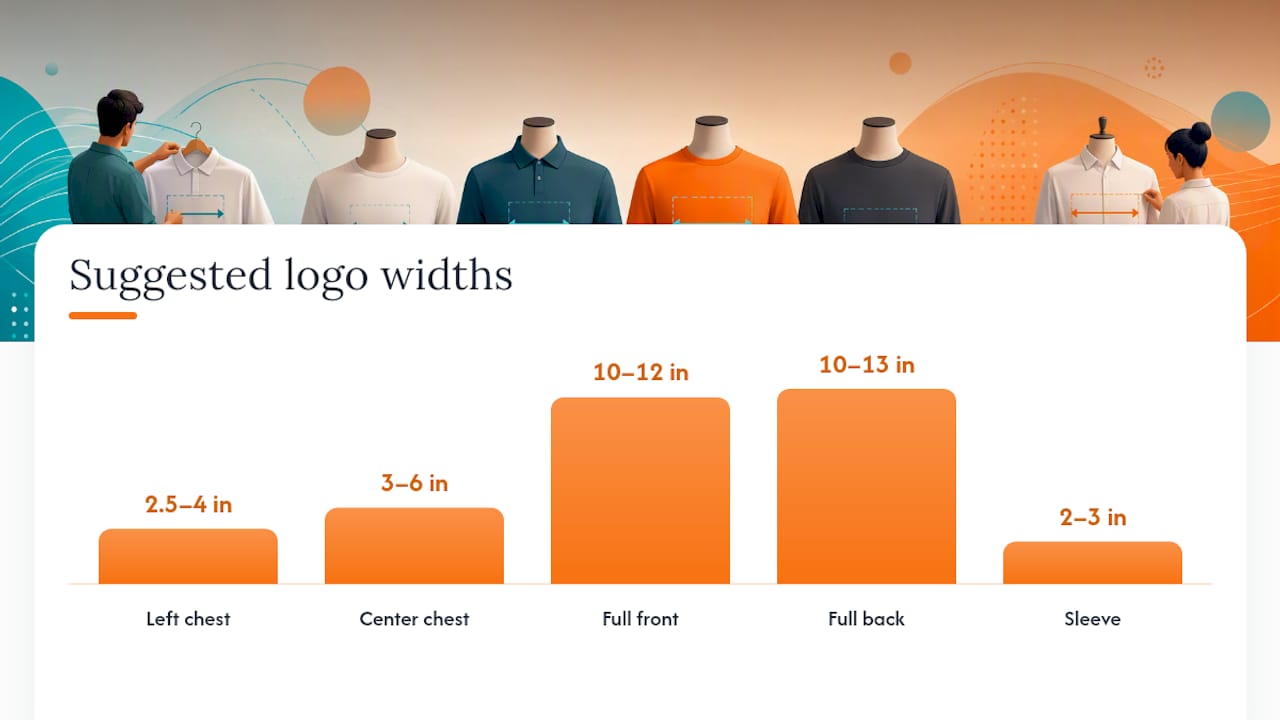
When scaling across sizes, adjust the logo width proportionally rather than using one static file for all sizes. A 4-inch logo that looks right on a large may feel oversized on a small and undersized on a 3XL.
Pro Tip: For asymmetrical logos, set your anchor on the visual weight of the design, not the file’s geometric center. A logo with a tall icon on the left and short text on the right will drift visually if you center it on the canvas midpoint. Shopify’s placement guide flags this as one of the most common causes of placement drift across a production run.
How your decoration method changes placement, size, and durability
The method you choose shapes every placement decision, from minimum logo size to which zones are even practical. Choosing a placement without considering the method first leads to artwork that either can’t be produced or looks worse than expected.
Embroidery works best for left-chest logos on polos, dress shirts, and uniforms. It’s durable, tactile, and reads as premium. The trade-off: fine detail, thin lines, and gradients don’t translate well into thread. Keep embroidered logos simple, at least 1 inch tall for text, and avoid placing them over thick seams or pockets where the hoop can’t sit flat. Minimum practical width is about 1.5 inches.
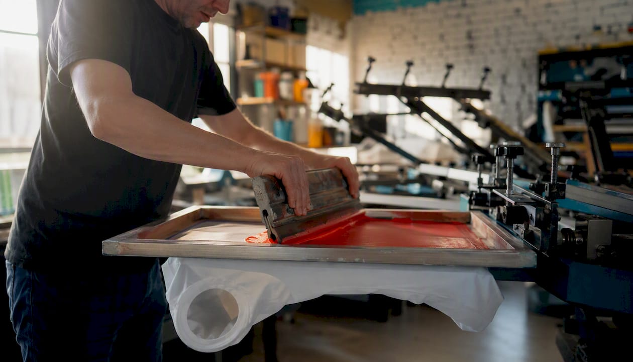
Screen printing is the workhorse for center chest, full front, and full back. It handles multi-color designs cleanly, scales well to large prints, and holds up through dozens of washes when cured correctly. It’s cost-effective at volume but requires a separate screen per color, so highly complex artwork drives up cost. Stahls’ placement tips recommend keeping screen-printed designs clear of seams and zippers, where ink can crack at stress points.
DTF (Direct-to-Film) transfers handle photographic detail, gradients, and small text that screen printing and embroidery can’t reproduce cleanly. DTF works across almost every placement zone and is practical for short runs where screen setup costs don’t make sense. For a detailed breakdown of when DTF outperforms screen printing and vice versa, Jam4apparel’s DTF vs. screen printing comparison covers the trade-offs by run size and artwork complexity.
Heat transfer / transfer paper is common for names, numbers, and simple one-color marks. It’s fast and low-cost for small quantities but less durable than screen printing or embroidery over time.
Puff embroidery adds a raised, three-dimensional texture to embroidered logos. It works well on caps and hoodies but is typically limited to bold, simple shapes. Fine detail collapses under the foam backing.
| Method | Detail Capability | Durability | Cost Impact | Best Placements |
|---|---|---|---|---|
| Embroidery | Low (simple shapes) | Very high | Medium | Left chest, collar, sleeve |
| Screen printing | Medium-high | High | Low at volume | Center/full front, full back |
| DTF | Very high | Medium-high | Low for short runs | Any zone, short runs |
| Heat transfer | Low-medium | Medium | Low | Names, numbers, small marks |
| Puff embroidery | Low (bold only) | High | High | Caps, hoodies, chest badges |
- Avoid embroidery on thin or stretchy fabrics (performance mesh, tri-blends) where the hoop distorts the weave.
- Screen printing on dark garments requires an underbase layer, which adds cost and slightly raises the print surface.
- DTF transfers can feel slightly stiffer than direct screen prints on very large designs.
For a full side-by-side of all decoration methods, Jam4apparel’s apparel decoration methods guide covers run sizes, artwork requirements, and cost structure.
What your artwork files need before you send them to production
Bad files cause placement errors more often than bad measurements. A logo submitted as a low-resolution JPEG with a white background will print with a visible white box around it, and the decorator can’t always catch that before the run starts.
File checklist:
- Vector preferred: AI, EPS, or PDF files scale to any size without quality loss. Send these whenever possible.
- Raster minimum: 300 dpi at the final print size. A 72-dpi web logo scaled up to 10 inches will print blurry.
- Transparent background: PNG with transparency or a vector file with no background fill. Never submit a JPEG for a print that needs a clean edge.
- Color mode: CMYK for screen printing and DTF. Pantone spot colors for exact brand color matching. RGB files can be converted, but conversion shifts colors, so confirm with your decorator before submitting.
- Anchor marked in the file: Add a small crosshair or note layer showing where the anchor point sits relative to the design. This removes ambiguity when the decorator places the artwork.
Embroidery digitizing notes:
- Embroidery requires a separate digitized file (DST, PES, or similar machine format), not a print-ready vector.
- Minimum stitch-able text height is roughly 0.25 inches for capital letters; smaller than that and letters merge.
- Simplify logos for embroidery: drop thin strokes, merge close colors, and remove gradients before sending to digitizing.
- Multi-color embroidery adds cost per color stop; three to five colors is a practical ceiling for most left-chest logos.
Proof request template (paste into your order notes):
“Please provide a scaled mock-up showing the logo at actual print/stitch size on a garment template, with measurement callouts from the collar to the top of the design and from the center of the shirt to the left edge of the design. Include a note on how placement will be adjusted across sizes.”
Pro Tip: Ask your decorator to flag any file issues before production starts, not after. A quick pre-production file review catches color-mode mismatches, low-resolution artwork, and missing transparency that would otherwise show up as a defect on the finished shirt.
How brand tone should guide your placement choices
Placement is as much brand psychology as it is aesthetics. A left-chest logo reads professional and credentialed. An oversized chest or back print reads bold, retail, and youth-oriented. Neither is wrong; they just say different things.
Matching placement to brand personality:
- Conservative or corporate: Left chest for the primary mark, upper back for a secondary tagline or website. This is the standard for hospitality uniforms, corporate polos, and healthcare staff shirts.
- Retail or merch-focused: Center chest or full front for the primary design, full back for a secondary graphic or slogan. This is what streetwear and band merch have used for decades because it works.
- Event or volunteer shirts: Full back for crowd visibility, left chest or center chest for staff identification. Custom event shirts often combine both zones for exactly this reason.
- Team or sports apparel: Back with name and number, left chest or center chest with the team mark. Sleeve logos work well for sponsor identification.
Balancing multiple logos:
- Establish a clear hierarchy: one primary mark, one secondary mark at most. Three logos on a single shirt almost always creates visual clutter.
- Keep secondary logos at least 30% smaller than the primary.
- Avoid placing two logos on the same horizontal plane; stagger them vertically or move one to a different zone entirely.
- Sponsor logos on the sleeve or upper back keep the front clean while still honoring the commitment.
If your logo needs a refresh before it goes on apparel, getting your brand identity right first saves you from reprinting shirts six months later.
Quick checklist: subtle vs. bold placement:
- Subtle: left chest, back collar, sleeve (under 3 in)
- Bold: center chest, full front, full back
- Audience is corporate or professional → subtle
- Audience is fans, students, or event attendees → bold
- Shirt is a uniform → subtle; shirt is merch → bold
Placement rules for polos, dress shirts, and uniforms
Polos and dress shirts follow stricter conventions than t-shirts, and for good reason. The fabric is typically finer, the collar structure changes the anchor point, and a chest pocket on many polo styles creates a real obstacle.
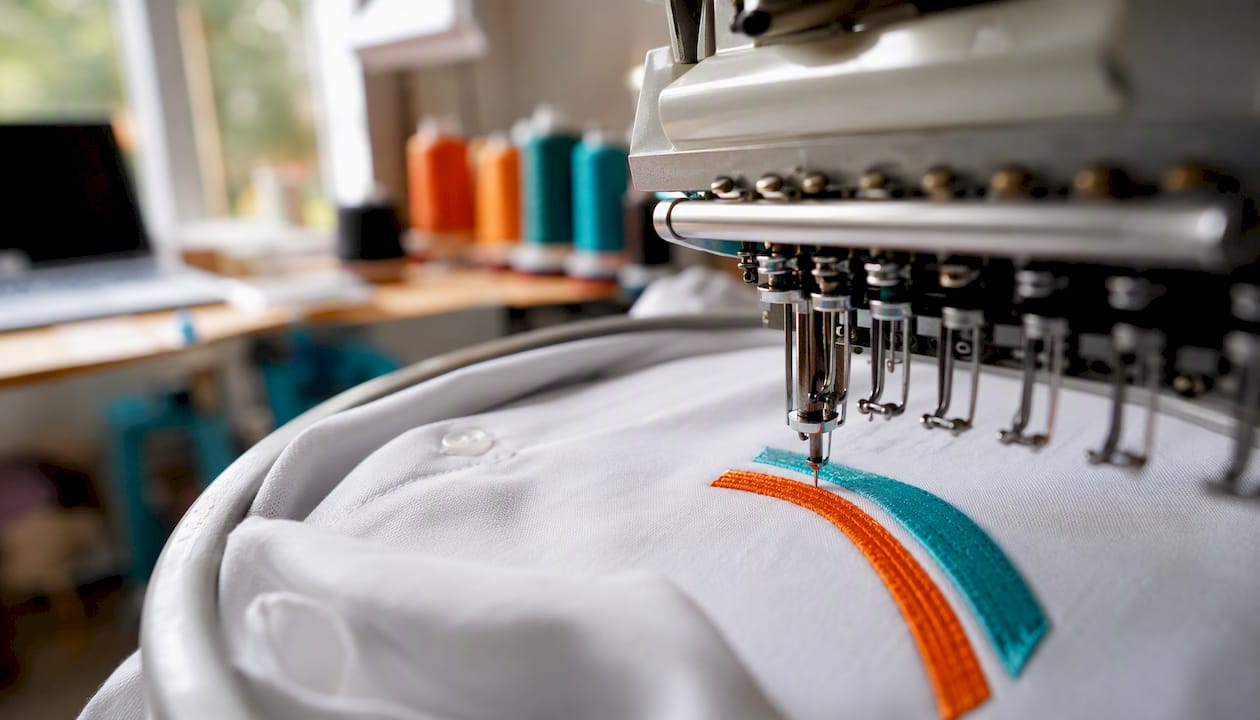
The standard for business polo embroidery is a left-chest logo, 2.5–3.5 inches wide, placed 3–4 inches below the collar and 4 inches from the shirt’s center. On a polo with a chest pocket, the logo goes above the pocket, not on it. Stitching through a pocket creates a visible ridge and can jam the pocket opening.
Key considerations for dress shirts and polos:
- Pique and performance fabrics used in most polos have a textured weave that affects stitch density. Ask your embroiderer to test stitch density on a swatch before running the full order.
- Button plackets on dress shirts shift the visual center of the chest. Measure from the placket edge, not the shirt center, to keep the logo optically balanced.
- Collar structure on polos sits higher than on a crew-neck tee, so the 3–4 inch drop from the collar seam places the logo slightly higher on the chest than it would on a t-shirt. This is correct for polos; don’t compensate by dropping it further.
- Consistent placement across matching team shirts reinforces brand identity. One inch of drift across a 50-shirt order is visible when the team stands together.
Pro Tip: Before approving a full embroidery run on polos or dress shirts, request a single embroidered sample on the actual garment style. Scale and stitch density look different on a pique polo than on a fleece hoodie, and catching a density problem on one shirt costs far less than fixing it across 100.
The checklist to send your decorator so placement is executed correctly
Clear specs prevent errors. Send this with every order, whether you’re working with Jam4apparel or any other decorator.
Order specification checklist:
- Garment style and color: Brand, style number, and colorway (e.g., Gildan 5000, Black).
- Placement zone: Left chest, center chest, full front, upper back, full back, sleeve, or back collar.
- Anchor distance: Inches from the collar seam to the top of the design, and inches from the shirt center to the nearest edge of the design.
- Logo file: Vector (AI/EPS/PDF) or 300-dpi PNG with transparent background, with the anchor point marked in the file.
- Decoration method: Embroidery, screen printing, DTF, heat transfer, or puff embroidery.
- Thread colors or Pantone numbers: Exact color references, not color names. “Red” is not a specification.
- Size grading note: Confirm whether logo dimensions should scale across sizes or stay fixed.
Sample proof request (paste into email or order notes):
“Please send a scaled mock-up showing the logo at actual production size on a garment template, with measurement callouts from the collar to the top of the design. Note how placement will be adjusted across sizes, and flag any seam or pocket conflicts.”
Clarifications worth requesting from your decorator:
- How will the design be handled if it falls near a seam or pocket?
- Is there a shrink allowance built into the placement measurement?
- How does the decorator grade placement across sizes (fixed anchor vs. proportional shift)?
A practical perspective on what actually goes wrong with logo placement
The most common placement mistake we see at Jam4apparel isn’t a wrong measurement. It’s a file submitted without a marked anchor point, combined with a verbal instruction like “left chest, normal spot.” Every decorator has a slightly different interpretation of “normal.” That ambiguity is where shirts come back looking off.
The second most common issue: a logo that looks fine at 4 inches on a large but overwhelms a small or disappears on a 3XL. Scaling the artwork proportionally across sizes, rather than using one static file for the entire run, fixes this almost every time.
What Jam4apparel checks on every proof before production:
- Anchor distance confirmed in inches from the collar seam, not estimated visually.
- Logo width verified at the actual print or stitch size, not the file’s canvas size.
- Placement checked against the garment’s pocket, seam, and button placket positions.
- Color references confirmed against Pantone or thread color charts, not screen approximations.
- Size grading reviewed to confirm the logo scales or holds correctly across the full size run.
Jam4apparel makes placement straightforward from proof to production
Getting placement right on paper is one thing. Getting it right across a 150-shirt order in six sizes, with embroidery on polos and DTF on the tees, is where in-house production makes the real difference.
Jam4apparel handles screen printing, embroidery, and DTF in-house at our Lake in the Hills, Illinois facility. Every order starts with a free digital proof showing your logo at actual size on a garment template, with measurement callouts. For embroidered orders on polos or dress shirts, single-sample options are available so you can verify scale and stitch density before the full run. Whether you need corporate uniforms, event shirts, or team apparel, request a free proof or quote at Jam4apparel and we’ll confirm placement specs before a single shirt goes into production.
Sources
- Logo Placement on Shirt: Sizes and Positions
- T-Shirt Logo Design Placement Guide w/ Size Chart
- Logo on Clothing Guide: Best Placement, Sizes & Printing Methods
- Design Placement Tips
Recommended
Ready to print your design?
Screen print, embroidery, and DTF — no minimums on many styles.