
Production Tested Left Chest Logo Size: Start at 3.5 Inches
August 29, 2026
Production Tested Left Chest Logo Size: Start at 3.5 Inches
Most adult garments look best with a left chest logo between 3 and 4 inches wide, and 3.5 inches is the size decorators reach for most often. Drop the design about 3 to 4 inches below the shoulder seam, or center it above the pocket on a polo. Embroidered designs with small text or fine detail sometimes need a slightly different width to stay legible, but that starting range holds for almost every t-shirt, polo, or jacket order.
TL;DR:
- Logos around 3.5 inches wide effectively balance visibility, proportion, and reading distance across most garment types, including shirts, polos, and jackets.
- Embroidery designs should stay within 4 inches for optimal appearance, while larger sizes risk shifting focus from the left chest to center or full-front placement.
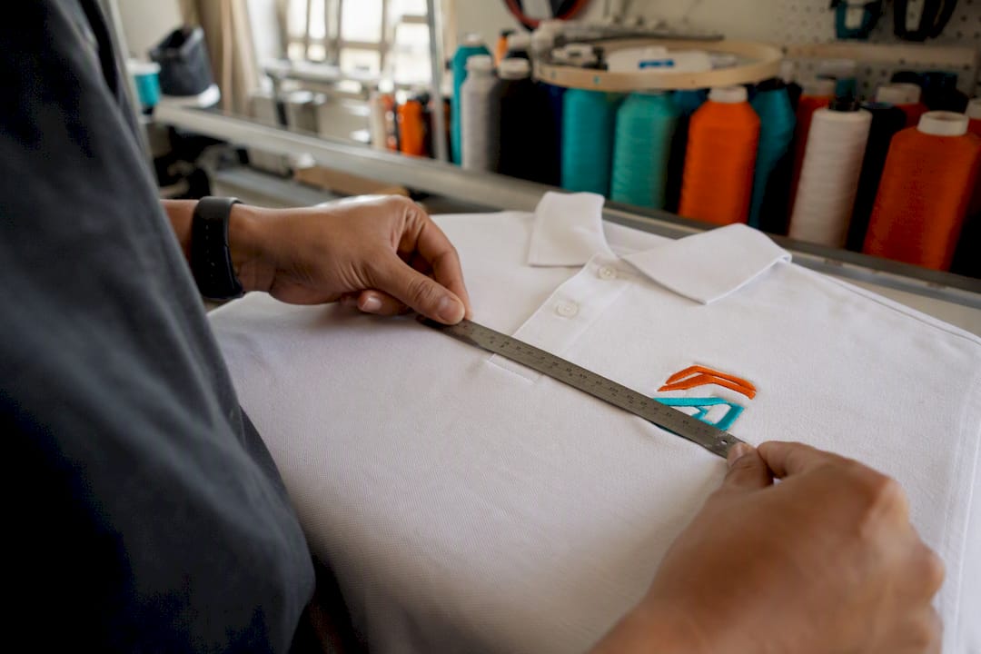
- Accurate placement depends on measuring drop from the shoulder seam and horizontal offset from center front, using garment features like plackets, pockets, or zippers as references.
- Embroidery is more size-sensitive than screen print or DTF, with small details or thin text often not translating well at sizes below 3.5 inches.
- Running a paper mockup and confirming exact measurements before production helps ensure the logo looks proportional and well-placed on the actual garment.
Table of Contents
- Left Chest Logo Size Chart by Garment Type
- How to Measure Drop and Horizontal Placement
- Embroidery vs. Screen Print vs. DTF: Sizing Differences That Matter
- Will Your Logo Actually Read at This Size? Artwork Rules That Matter
- Your Pre-Order Checklist: Measuring and Mocking Up Left Chest Placement
- What We See on the Production Floor at Jam 4 Apparel
- Why the First Mockup Rarely Matches the Final Shirt
- Get Your Left Chest Design Sized Right the First Time
- Sources
Left Chest Logo Size Chart by Garment Type
The 3 to 4 inch range isn’t arbitrary. It’s the width that clears the pocket, sits comfortably below the collarbone, and still reads clearly from a few feet away, whether someone is looking at a barista’s polo or a contractor’s work jacket. Smaller logos risk becoming less visible, while larger ones may compete visually with the collar or shoulder seam. Most production charts put 3.5 inches as the number that balances visibility against proportion, and that’s a solid default if you’re ordering across multiple garment types and don’t want to manage five different files.
Here’s how that baseline shifts once you factor in garment cut and fabric weight:
Embroidery-specific guidance generally lands in the same neighborhood but nudges jackets and hoodies toward the top of the range, since thicker outerwear fabric can visually shrink a design that would look perfectly sized on a t-shirt.
If you’re running a mixed order that includes both polos and tees, don’t build two separate files. A universal width around 3.25 to 3.5 inches usually works across both without looking undersized on one or oversized on the other. That single decision saves a design revision and, for embroidery, an extra digitizing fee.
There’s an upper limit worth knowing about too. Once a design pushes past 4.5 inches wide, it stops behaving like a left chest logo and starts competing with center-chest or full-front placement. Digitizing guides note that finished embroidery designs rarely exceed 4.5 inches for a reason: past that point, the visual weight shifts the eye away from the left chest zone entirely, and the garment starts to look like it was designed for a different placement altogether. If a logo requires larger space to be legible, considering center-chest placement instead of left chest may be more appropriate.
How to Measure Drop and Horizontal Placement
Size only gets you halfway there. Placement is what makes a logo look intentional instead of slapped on, and it comes down to two measurements: how far down from the shoulder seam, and how far over from center.
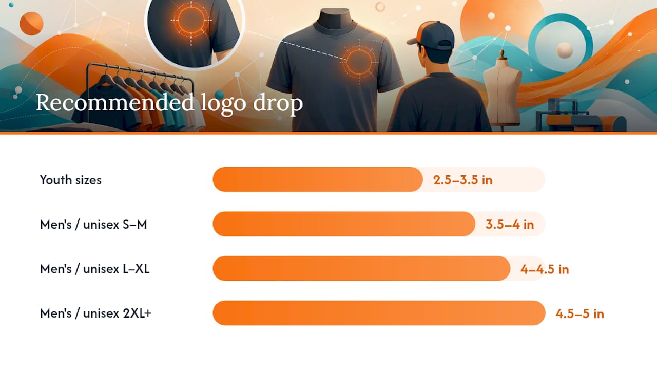
Start at the shoulder seam, the ridge where the sleeve meets the body of the shirt. Measure straight down along the front panel. Placement guides generally recommend these drops by size:
- Men’s/unisex S–M: 3.5–4 inches down from the shoulder seam
- Men’s/unisex L–XL: 4–4.5 inches down
- Men’s/unisex 2XL and up: 4.5–5 inches down
- Youth sizes: 2.5–3.5 inches down, scaled to torso length
- Fitted women’s cuts: measure the same way, but check the logo doesn’t land on a dart or seam that could distort it
For horizontal placement, measure from the center front (the vertical line running down the middle of the shirt) outward. Most adult crew necks put the center of the logo about 4 to 4.5 inches from that centerline, which typically lines up with where a chest pocket would sit even if the shirt doesn’t have one.
A few garment-specific adjustments matter here:
- Polos: use the placket (the button strip) as your reference instead of guessing from the collar. Center the logo between the placket and the armhole seam, not between the collar and the sleeve.
- Pocketed shirts: if there’s a real pocket, center the logo directly above it, roughly half an inch to an inch higher than the pocket’s top edge.
- Zip jackets: use the zipper as your vertical reference line instead of an imaginary centerline, since the zipper is what the eye actually tracks.
- Fitted or tapered garments: placement math shifts slightly because the side seams pull inward. Mock it up on the actual garment rather than a flat measurement, especially for women’s cuts.
Get a mockup before finalizing anything. A logo that measures correctly on paper can still look off-center once it’s on a body, because chest shape and posture change how the eye reads placement. That’s the gap between a spec sheet and a shirt someone actually wears.
Embroidery vs. Screen Print vs. DTF: Sizing Differences That Matter
The same logo doesn’t always translate the same way across decoration methods, and this is where a lot of first-time buyers get surprised by their proof.
Embroidery is the most size-sensitive of the three. Needle and thread can’t render the same fine detail a printer can, so embroidery guides often recommend staying closer to the smaller end of the range, especially for logos with intricate linework or gradient shading that thread simply can’t replicate. Stitch density becomes a real constraint at small sizes. Text under a certain height turns into a blurry line of thread rather than legible letters, and thin logo elements can distort or “fill in” once stitched.
Screen printing and DTF (direct-to-film) handle fine detail far better, since both methods are essentially printing ink or film onto fabric rather than building an image out of thread. That gives you more room to run a slightly larger or more detailed design at left chest scale, and it’s part of why many multi-color or photorealistic logos go to print rather than thread.
A few practical points worth keeping straight:
- Embroidery favors bold shapes and limited color counts. Fine gradients or thin serif fonts rarely translate well.
- Screen print and DTF handle gradients, small text, and complex color layering with far less risk of distortion.
- Stitch count and density affect both cost and hand feel. A denser design at a smaller size can also add stiffness to the fabric.
- Always ask your decorator for digitizing notes or a stitch simulation before production starts, not after.
Pro Tip: If you’re not sure which method fits your logo, send the artwork to your decorator and ask directly: “Will this hold up at 3.5 inches in embroidery, or does it need to go to print?” A good shop will tell you honestly, even if it means steering you toward a different decoration method.
Digitizers generally prefer to build the stitch file at the exact target width from the start, because scaling a finished embroidery file up or down afterward tends to degrade stitch quality rather than simply resize it cleanly.
Will Your Logo Actually Read at This Size? Artwork Rules That Matter
A logo that looks sharp on a screen doesn’t automatically translate to fabric at 3.5 inches. Text and fine detail are usually where things fall apart first.
- Check your smallest text. Supporting text under roughly 5mm cap height tends to blur into an unreadable smudge once it’s stitched in satin thread, and it doesn’t fare much better in a small screen print. If your logo has a tagline or founding year in tiny type, expect to simplify or drop it.
- Match the shape to the space. A round badge or circular emblem needs roughly equal width and height, which caps how large it can go before it competes with the collar. A horizontal wordmark can run wider but shallower, which usually fits the left chest zone more naturally.
- Run a physical test before approving anything. Print your logo at the proposed size on regular paper, cut it out, and hold it against a shirt in the mirror. It sounds low tech because it is, but it catches problems no screen ever will.
- Compare it against something familiar. A standard business card is about 3.5 inches wide, so holding your printed logo next to one gives you an instant, physical sense of scale before you commit to a production file.
- Decide early whether to simplify. If small elements disappear at the target size, don’t just shrink the whole design smaller to compensate. Simplify the artwork instead. Drop a drop shadow, thicken a thin line, or remove a tagline that isn’t earning its space.
Your Pre-Order Checklist: Measuring and Mocking Up Left Chest Placement
Before any artwork goes to production, run through this sequence. It takes fifteen minutes and it’s the difference between a proof you approve on the first try and one that bounces back for revisions.
- Lay a sample garment flat and measure the drop from the shoulder seam down to your intended logo position, using the size-specific ranges above as a starting point.
- Measure the horizontal offset from center front, checking it against the placket, pocket, or zipper depending on garment style.
- Mark the placement directly on the garment with a fabric pencil or painter’s tape so you have a physical reference, not just a number on paper.
- Print your logo at the exact target width on regular paper, cut it out, and hold it against the marked spot on the garment.
- Photograph the mockup on the actual garment, front and slightly angled, and share it with anyone else who needs to sign off.
- Write the final width in inches directly in your order notes. Don’t leave it to “medium” or “standard.” Give the decorator an exact number.
- For embroidery orders, request digitizing notes or a stitch simulation before production runs, especially if your logo has small text or fine detail.
Pro Tip: Take the mockup photo in the same lighting and against the same background you’d use for a marketing photo. If the logo looks proportionate there, it’ll look right on the actual production run, too.
What We See on the Production Floor at Jam 4 Apparel
Jam 4 Apparel starts most left chest orders at 3.5 inches wide and adjusts from there based on garment type and design complexity. Jackets and hoodies often move up toward 4 to 4.5 inches, while dress shirts and youth sizes come down.
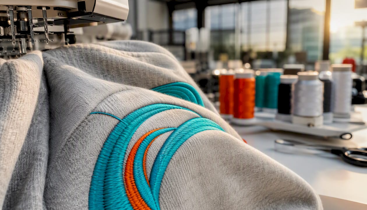
Production reality shapes those decisions daily. Minimum stitch lengths, digitizing scale limits, and small-text policies all factor into whether a logo gets built exactly as submitted or comes back with a suggestion to simplify first. That’s a normal part of getting a design production-ready, not a red flag.
Every order gets a free proof before anything runs, so sizing and placement get confirmed before production, not after.
Why the First Mockup Rarely Matches the Final Shirt
The most common mistake I see isn’t a bad logo. It’s a logo sized correctly on a screen and never checked against an actual garment. Digital mockups lie about scale constantly, especially on curved chest panels or heavier fabric like fleece.
The second mistake is ignoring the placket or pocket and centering purely off the collar, which throws off polos every time. The third is cramming in supporting text that was never going to survive at 3.5 inches.
Follow the drop measurements, run a paper mockup, and lock your width in inches before you submit artwork. It’s a fifteen-minute habit that prevents a reprint.
— Adam
Get Your Left Chest Design Sized Right the First Time
Jam 4 Apparel builds every left chest order the same way described above: start at the standard width, adjust for garment and decoration method, and confirm placement with a free proof before anything runs. That in-house step is what separates a shop that gets your logo right the first time from one that leaves sizing to a template.
Jam 4 Apparel handles custom embroidery, screen printing, DTF transfers, and full digitizing, all produced in-house in Lake in the Hills, Illinois, which keeps turnaround fast and pricing straightforward. To get a production-ready quote, send your logo file, the garment style and quantity you need, and your preferred decoration method. If you’re outfitting a team, school, or business, the industries page walks through options by category, and every order includes a free design proof so you can confirm size and placement before production starts. Ready to see your logo sized correctly? Request a quote and Jam 4 Apparel will send back a proof showing exactly how it’ll look on the garment you chose.
Sources
- Standard Left Chest Logo Size: Complete Guide (2026) - Dimensions Flow
- 7 Best Left Chest Logo Size Guide for Embroidery (2026) - A1Digitizing
- Left Chest Logo Size Guide for Embroidery 2026 - USA Digitizing Pro
- Left-Chest Logo Sizing Chart for Shirts & Jackets - Bear Transfers
- The Complete Embroidery Placement Guide - AppliqueFits
Recommended
Ready to print your design?
Screen print, embroidery, and DTF — no minimums on many styles.