Custom Screen Printing Color Limits: Designer's Guide
June 16, 2026
Custom Screen Printing Color Limits: Designer’s Guide
Custom screen printing color limits are defined by the number of individual ink layers a press can apply in a single print run, with most professional setups handling between 1 and 6 spot colors efficiently. Every color in a screen print requires its own screen, its own ink, and its own pass through the press. That constraint shapes every decision from artwork prep to final cost. Understanding where those limits come from, and how to work within them, separates clean, vibrant prints from costly reprints and missed deadlines.
1. custom screen printing color limits: what the numbers mean
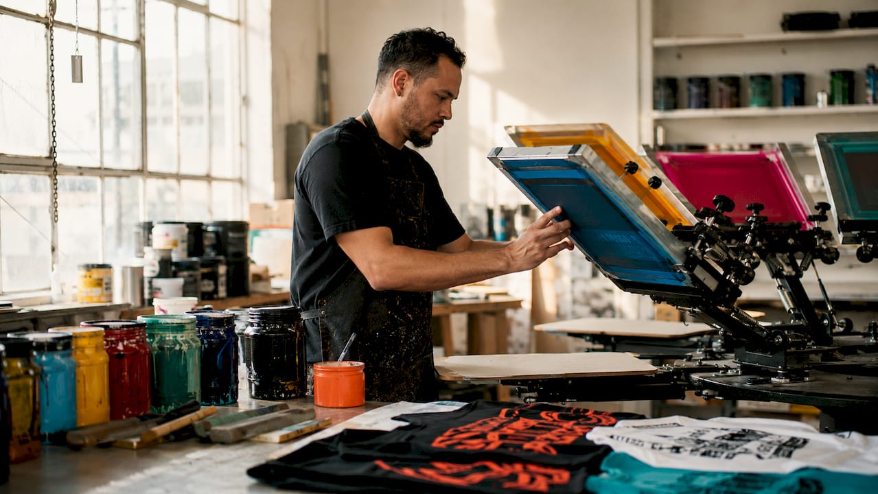
Screen printing color limits are not arbitrary. They come directly from how the process works. Each color in your design gets burned onto a separate mesh screen, and each screen must align precisely with every other screen on the press. That alignment is called registration, and it gets harder to maintain as color count climbs.
Most manual presses handle 4–6 spot colors before complexity and cost start working against you. That number reflects real shop conditions: flash cure units between stations, press arm count, and operator attention. Automatic presses can run 8, 10, or even 12 colors, but each additional station adds setup time, increases the chance of misregistration, and raises your per-unit cost.
The practical sweet spot for most custom t-shirt printing jobs is 1–4 colors. That range covers the vast majority of logos, team designs, and branded apparel without pushing into territory where quality risks multiply.
2. how press type shapes your color options
The press you print on sets a hard ceiling for your screen printing color options. Manual presses typically have 4 to 6 arms, meaning 4 to 6 screens maximum. Automatic presses can carry more stations, but they require longer setup and higher minimum quantities to justify the cost.
Key factors that determine how many colors a press can run:
- Station count: Each arm holds one screen. No arm, no color.
- Flash cure units: Flashing wet ink between layers takes up a station, reducing available color slots.
- Registration tolerance: More colors mean more chances for screens to fall out of alignment, especially on stretchy fabrics.
- Ink opacity: Lighter inks on dark garments may need double-stroke passes, which consume time and can affect color layering.
Pro Tip: If your design has 5 colors and prints on a dark shirt, count the underbase as color number 6. That single addition can push a 4-station manual press past its limit.
Advanced shops with 10-color automatic presses can produce near-photographic results, but those jobs carry significantly higher setup fees and are best suited for large runs where cost per unit drops enough to offset the complexity.
3. spot colors vs. process colors: which limits apply?
The two major color systems in screen printing, spot colors and process colors (CMYK), operate under completely different rules and carry different limits.
Spot colors are premixed inks, each applied through its own dedicated screen. Pantone Solid Coated references are the industry standard for spot color communication, and Pantone matching prevents the color drift that happens when printers mix by eye. Spot colors produce vibrant, solid hues with excellent opacity. Their limit is straightforward: one screen per color.
Process colors (CMYK) use four screens, cyan, magenta, yellow, and black, printed as halftone dots that optically blend into thousands of colors. CMYK halftone printing runs at 45–55 LPI (lines per inch) for garment inks and can simulate photorealistic images. The tradeoff is technical complexity. Halftone angles, dot gain on fabric, and mesh count all affect the final result.
When to choose each system:
- Choose spot colors for logos, text-heavy designs, and solid shapes where color accuracy and vibrancy matter most.
- Choose CMYK process printing for photographic images, complex gradients, or designs with more than 8 distinct colors.
- Use a hybrid approach, spot colors plus a CMYK base, for designs that need both brand-accurate solids and photorealistic elements.
- Default to spot colors for small runs. Process printing requires more press calibration and is harder to justify on orders under 48 pieces.
4. artwork prep that makes or breaks multi-color prints
Technical artwork preparation is where most multi-color screen printing projects succeed or fail. The file you send to your printer determines whether your colors align cleanly or bleed into each other.
Follow these file preparation standards for any multi-color job:
- File format: Vector files (AI, EPS, PDF) are the standard. Raster elements embedded in those files must be at least 300 DPI at final print size.
- Trapping: Apply 0.25–0.5pt trapping at every boundary where two colors meet. This small overlap prevents white gaps caused by press misregistration.
- Font and stroke handling: Outline all fonts and expand all strokes before sending files. Live text and unresolved strokes cause unpredictable separations.
- Color mode: Convert all colors from RGB to CMYK or assign Pantone Solid Coated swatches for spot color jobs. RGB values do not translate directly to ink.
- Underbase layer: Add a white underbase separation for any design printing on a dark or colored garment. Label it clearly in your layer stack.
- Halftone frequency: Set halftone screens at 45–55 LPI for standard garment printing. Going higher requires a finer mesh and increases dot gain risk.
| Artwork Element | Recommended Standard | Why It Matters |
|---|---|---|
| File format | Vector (AI, EPS, PDF) | Resolution-independent, clean separations |
| Raster resolution | 300 DPI minimum | Prevents pixelation in embedded images |
| Trapping | 0.25–0.5pt at color edges | Closes gaps from press misregistration |
| Color mode | CMYK or Pantone Solid Coated | Accurate ink mixing and brand consistency |
| Halftone frequency | 45–55 LPI | Optimized for garment ink and mesh count |
Pro Tip: Ask your printer for their specific mesh count before finalizing halftone frequency. Shops running 110-mesh screens for bold prints need different LPI settings than shops using 160-mesh for fine detail work.
For a deeper look at how mesh count affects color reproduction, the screen mesh guide from Jam4apparel covers the technical side in detail.
5. how garment type and ink choice affect color count
The shirt itself is part of the color equation. Fabric color, fiber content, and surface texture all influence how many colors you can realistically print and how vibrant those colors will appear.
- Dark garments require an underbase. A white underbase on dark fabrics is a separate color separation. A 4-color design on a black shirt becomes a 5-color job automatically. Budget and press capacity must account for this.
- Performance fabrics and poly blends require specialty inks, often low-bleed or dye-migration-resistant formulas. These inks have different opacity and layering properties that can limit how many colors stack cleanly.
- Plastisol inks are the industry default. They offer vibrant colors and strong wash durability on cotton and blends. Their opacity makes them forgiving on dark garments.
- Water-based inks produce a softer hand feel and are a more sustainable option, but they require more precise curing and can be less opaque, which limits their use on dark fabrics without an underbase.
- Garment color affects perceived vibrancy. Printing a yellow ink on a white shirt looks completely different from the same yellow on a gray shirt. Color selection must account for the base fabric color, not just the ink swatch.
Mesh count also plays a role here. Standard prints run on 110–160 mesh screens. Higher mesh counts support finer halftone reproduction and smoother gradients, which matters when you are pushing toward the upper end of your color palette for custom printing.
6. cost and turnaround tradeoffs by color count
Each additional color increases setup fees and press time. That is not a minor variable. It is the primary driver of screen printing pricing for small and mid-size orders.
Here is how color count typically maps to cost and complexity:
| Color Count | Setup Complexity | Best For | Cost Impact |
|---|---|---|---|
| 1–2 colors | Low | Text logos, simple graphics | Lowest cost per unit |
| 3–4 colors | Moderate | Team apparel, branded tees | Moderate setup fees |
| 5–6 colors | High | Detailed artwork, event shirts | Higher setup, longer run times |
| 7+ colors | Very high | Photorealistic or specialty prints | Significant cost increase |
Designs with 1–3 colors deliver the best unit economics for bulk orders. Every color added beyond that point should earn its place in the design.
Strategies to reduce color count without losing design impact include converting gradients to halftones of a single ink, using the garment color as a design element instead of printing a background, and consolidating similar shades into one ink mix. A skilled designer can often cut a 6-color design to 4 colors with no visible loss of quality.
For a full breakdown of what setup fees look like in Illinois, the screen printing setup fee guide from Jam4apparel explains exactly what you are paying for and how color count drives those numbers. If turnaround time is a concern, the custom apparel turnaround guide shows how color complexity affects production schedules.
Key takeaways
Effective color management in screen printing means matching your design’s color count to your press capacity, garment type, and budget before artwork is finalized.
| Point | Details |
|---|---|
| Practical color limit | Most professional presses run 1–6 spot colors efficiently before cost and complexity spike. |
| Underbase adds a color | Dark garments require a white underbase, which counts as a full additional color separation. |
| Spot vs. process choice | Use spot colors for solid logos; use CMYK process printing for photorealistic or gradient-heavy designs. |
| Artwork prep is non-negotiable | Vector files, 300 DPI rasters, 0.25–0.5pt trapping, and correct color mode prevent costly reprints. |
| Color count drives cost | Each added color increases setup fees and press time; 1–3 colors offer the best unit economics for bulk runs. |
Where i stand on color limits after years in the shop
I have seen designers submit 8-color artwork for a 48-piece order and genuinely not understand why the quote came back three times higher than expected. The color count conversation is one that needs to happen before the design is finished, not after.
My honest position: fewer colors almost always produce better prints. Not because ambition is wrong, but because every color you add introduces another registration variable, another flash cure step, and another opportunity for something to go slightly off. The cleanest, most durable screen prints I have seen come from designs that use 2 to 4 well-chosen spot colors on the right garment.
The designers who get the best results are the ones who treat the printer as a collaborator from day one. Share your Pantone references early. Ask about the press setup before you finalize your file. Find out if the garment you chose requires a specialty ink. A step-by-step t-shirt design process that accounts for print constraints from the start saves everyone time and money.
If you are a small business owner ordering branded apparel, push your designer to simplify. A 3-color version of your logo will print sharper, cost less, and hold up through more washes than a 7-color version that pushes the press to its limit. That is not a compromise. That is smart production.
— Adam
Print smarter with jam4apparel’s screen printing team
Jam4apparel handles custom screen printing for businesses, schools, sports teams, and nonprofits throughout the Chicagoland area, including Lake in the Hills, Elgin, and McHenry. The in-house production team works with you to match your design’s color complexity to the right press setup, ink type, and garment choice before a single screen is burned.

Whether you are printing a 2-color logo on 500 polo shirts or a 6-color event design on a limited run of hoodies, Jam4apparel’s team reviews your artwork and flags any color or file issues before production starts. Get a quote and talk through your color options at Jam4apparel’s screen printing page. If you want to explore no-minimum options for complex color designs, DTF printing removes the per-color cost structure entirely.
FAQ
How many colors can screen printing handle?
Most manual screen printing presses efficiently handle 4–6 spot colors. Automatic presses can run 8–12 colors, but setup costs and complexity increase significantly with each additional color.
Does the underbase count as a color?
Yes. A white underbase on dark garments is a separate screen and a separate ink layer. It counts as one full color in your total separation count.
What is the difference between spot and process colors?
Spot colors are premixed inks, each requiring its own screen, and are best for solid logos and brand colors. Process colors (CMYK) use four screens with halftone dots to simulate a full color range, including gradients and photorealistic images.
Why does adding colors increase the price?
Each color requires a separate screen, additional setup time, and more press passes. Setup fees and press time both scale with color count, which is why 1–3 color designs offer the lowest cost per unit on bulk orders.
What file format should i send for a multi-color print?
Send vector files in AI, EPS, or PDF format. Any raster images embedded in those files must be at least 300 DPI at final print size. Assign Pantone Solid Coated swatches or CMYK values to every color in the design.
Recommended
Ready to print your design?
Screen print, embroidery, and DTF — no minimums on many styles.